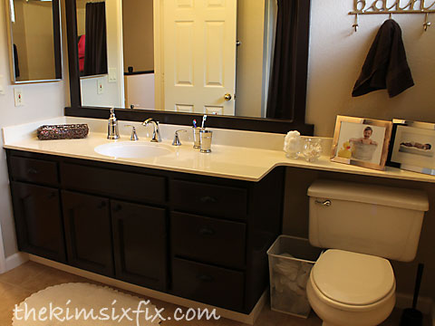
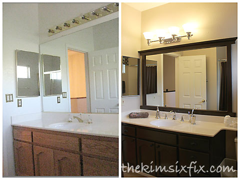
The full original reveal from 2011 can be seen here, and here is what it looks like today, more than 3 years later.
The first thing I did was take down the old brass sliding shower door and replaced it with a curtain (Full tutorial on that is a previous flashback Friday post)

We lived with the bathroom for a while like this until I couldn’t stand it for one more minute and decided it was time for a major (albeit cosmetic) overhaul.
I painted the walls (Martha Stewart’s Buckwheat Flour) and added a window treatment. I didn’t want a color that was too dark, but I needed a lot more contrast between the molding and the walls.
 Also, a quick tip: See how the curtain/valance is hung COMPLETELY above the window? It makes the long thin window look taller and doesn’t block any of the much needed natural light.
The most dramatic difference was cutting down and framing the mirror (full tutorial here.)

I also replaced the outdated fixtures:

I painted the oak cabinets (Burl by Martha Stewart):

I got rid of ALL the other brass.. the switch plate covers, the light fixture and the medicine cabinet (which I spray painted):

It was a very dramatic update and cost less than $500. The ‘after’ photos in these posts are from this morning. That shows how well they have held up all this time. And they take a beating.. I have scraped blobs of blue toothpaste off the doors and drawers more times than I care to count.
One day I do want to tear out the cabinets and put in a new countertop.. but for now, the $500 has been money well spent.
Sharing at Remodelaholic, HomestoriesAtoZ , ThriftyDecorChick these parties.


Thanks for the tips and inspiration! I am just about to get started on my guest bath. Wish me luck!
ReplyDeleteThat is some makeover Kim. Looks fantastic!
ReplyDeleteIt looks amazing. I love how it turned out.
ReplyDelete