When I saw The Rustic Pig's Ironing Board turned Welcome Sign on Pinterest a while back I loved how it looked propped up on the front doorstep. I have been keeping my eye out at the flea markets and thrift stores for an old ironing board, but that has been an impossible mission.
 |
| This image isn't pinable, please use original source |

(This was originally a floor model display door from a sample kitchen, it is really a Lidingo 15x64 door panel, which retails for $134! I'm telling you.. ALWAYS CHECK THE AS-IS DEPARTMENT!)
My original idea was to stencil the word “Welcome” on it in black and call it a day, but I decided I wanted more of the aged vintage look like the original.
Instead of just painting and distressing it with sandpaper, I decided to use the school glue crackle finish technique I used previously on the pair of boat oars that went into the nursery.
I applied a LOT of white school glue all over the surface:

Then brushed it out to set the direction of the cracks:

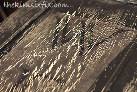
I wanted the crackle finish to really show so I used a sample of grey-black ‘oops’ paint as the top coat:

As the paint dried the cracks were really obvious between the white door surface and top coat. After it had completely dried I cut a stencil out of dollar store contact paper and stuck it down to the door:

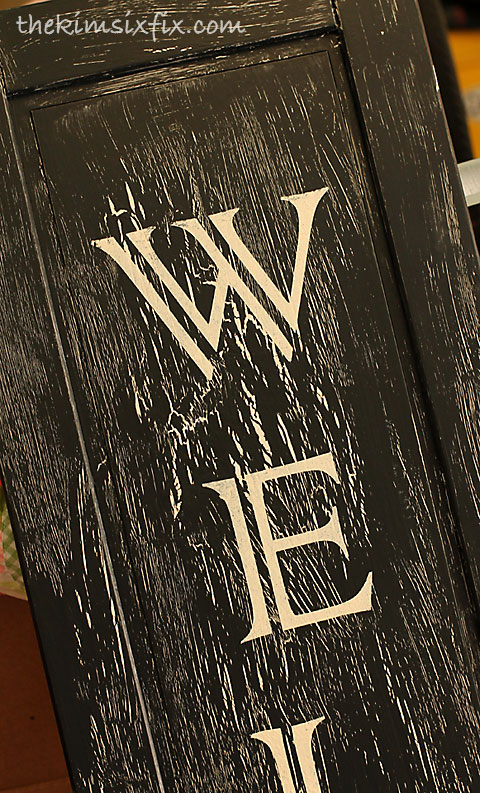
The font I chose was Colonna NT (a default font that came with my computer, but you can download it here) because I loved the look of the split letters:

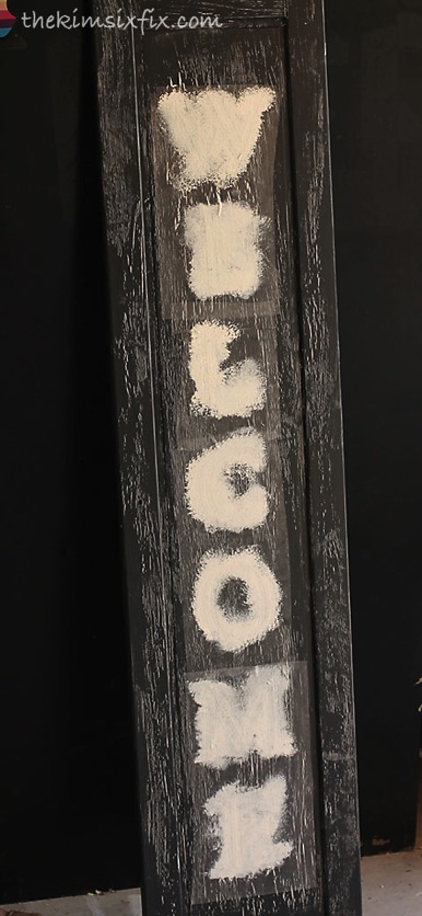
I used off white to stencil the letters themselves:

I really liked the result:

At this point I thought I was finished. I set it up outside just like my inspiration sign:

I lived with it for a couple days, but there was something about it that bothered me. The high contrast in the paint didn’t truly look old, especially the bright white letters.
So I sanded the edges with some fine grit sandpaper and then I watered down some brown paint (Burl by Martha Stewart from my bathroom cabinetry) and gave the entire thing a once over.

Here is a little trick to get ‘faux water stains’ on your finish:
1. Give the surface a quick coat of oil based stain and quickly wipe most of it (you want it to still be a little damp.
2. Working quickly, splatter it with water based paint and immediately wipe that off with a slightly damp rag.
When the water based paint hits he oily surface it will separate leaving distinctive rings and stains:

The finished version definitely looks more ‘authentically vintage.’

I set it back on the front step, but I loved it so much I decided to try it out in some other locations.

I hung it on the front of the house for a while:

Finally, I decided to move it indoors. It is currently hanging up for you to see as you walk into the house. I had the perfect long thin spot right above the cat door:

I love how it came out, especially since my total investment was less than $4.

Sharing at Homestories AtoZ, MyRepurposed Life and these great parties


This turned out amazing! I really like it hung inside the house, too.
ReplyDeleteVery, very cool! The sign came out great!!
ReplyDeleteLovely! And such a steal for less than $4! Thanks for visiting Night Owl Corner....just stopping by to
ReplyDeletecheck out your blog too!
Linda
Love the weathered look. It's a great project.
ReplyDeleteWow. I love this welcome sign! Thanks for explaining all the different steps you took to transform and IKEA door into something that looks antique!
ReplyDeleteWhat a great use for the IKEA as is section! It came out great.
ReplyDeleteI ALWAYS hit the as is section at IKEA too Kim! I also got some cabinet doors from there a year or so ago and used one for a coat hanger in the laundry room. Now, you've inspired to use one and make a welcome sign! Love your technique too :-)
ReplyDeleteLove it! You totally rocked the weathered look!
ReplyDelete