So I decided instead of just emailing her back, I’d spend a day or two writing up a HeRO post with all my ideas and give you guys the chance to make any suggestions as well.. 

(I think it is time to get a new graphic since that one is awful and still has my old branding on it!)
From Lisa: "We just bought our home and have an eyesore of a fireplace. We have a rectangle lower living area where we spend much of our time. In my opinion the fireplace is misplaced. It is not a focal point but off to the side. I recently painted the paneling walls hoping it would look better but it doesn't. I do want to add a mantel made out of a reclaimed beam but have no desire to find one until I can decide what to do with the fireplace. Thought of painting it or recovering it. Any suggestions would be GREATLY appreciated? This is a working fireplace and we intend to use it this winter.”
The space is on a lower level and I totally agree with her that the number one biggest problem is the space has no true focal wall. It has a beautiful functional wood burning stone fireplace, but it is pushed into one corner at the narrow end of the room.
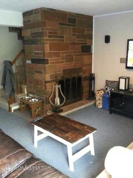
The room itself is long and thin, which is always somewhat problematic for furniture placement, even without having to contend with a giant wall of stone off to one side.
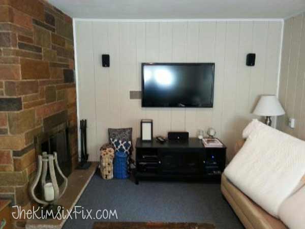
Plus, to make it even tougher, she also has sliding glass doors on the opposite wall which means it is hard to place furniture that actually faces the fireplace.

I do think she did the right thing by painting the wood paneling.. and I even love the color. I wouldn’t change it. The question is, how to deal with this fireplace so it doesn’t feel so disconnected from the rest of the space.

The first thing I knew was because you can see the fireplace from multiple sides, you need to treat it like a double sided fireplace.
If it were me I would wrap the mantle around it in the shape of an “L” and not just put the mantle over the firebox opening. I found some examples to show what I am talking about:
I love the “peek-a-boo” stone on this one:
And this one is pretty also (see how the mantel wraps all the way around?):
And here is a much simpler version:
THIS ONE pretty much NAILS what I would do with the mantel design if I owned Lisa’s fireplace:
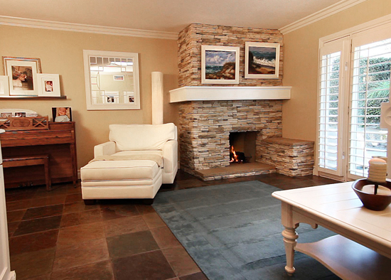

A big chunky mantle that cuts off the vertical line of the fireplace. It makes your eye wrap all the way around instead of drawing your eye up and down.
Here is another example of the wrap around mantel on a corner fireplace, only this time the fireplace is lighter and blends into the walls more:
 |
| source: BHG |
I personally love this look. The fireplace is part of the room without being overpowering, you don’t necessarily notice it is off center or pushed into the corner. Instead your eye keeps moving along the room (so you actually notice that crazy zebra ottoman/table.)
I think a big part of the success in this design is the crown molding at the ceiling. That is another thing I would recommend. To break up all the vertical lines in the space. (the paneling, the long thin room and the tall floor to ceiling fireplace) I would add crown molding and continue it around the top of the fireplace. (To see the difference compare the white/marble fireplace to the stacked stone one in the image above it. Notice how the crown moulding pulls the fireplace against the wall.. vs the stone fireplace which almost seems to float out in front of the wall?)
I think a big part of the success in this design is the crown molding at the ceiling. That is another thing I would recommend. To break up all the vertical lines in the space. (the paneling, the long thin room and the tall floor to ceiling fireplace) I would add crown molding and continue it around the top of the fireplace. (To see the difference compare the white/marble fireplace to the stacked stone one in the image above it. Notice how the crown moulding pulls the fireplace against the wall.. vs the stone fireplace which almost seems to float out in front of the wall?)
Which finally brings me to what I would do with the stone itself:
I would whitewash it or paint it.
I would whitewash it or paint it.
This is pretty much EXACTLY the finish I would use on Lisa’s fireplace (even the stone is similar):
 |
| Source: Update Dallas |
And that example even has the wrap around mantel and the crown molding. It is so pretty. In Lisa's case, I would replace the marble with reclaimed barn timber. As for the exact colors, I would choose a few shades lighter than the wall for the stone and a dark stained beam. Here is a pretty example of a corner fireplace with a similar color layout:
 |
| Source: Sarah Richardson Via DecorPad |
Here is a rough mock-up of how that woudl actually look in the space:


When you look at them side by side you can really see how the crown molding minimizes the sharp eye line that results from the stone abruptly stopping at the wall. You need the horizontal eye lines.

Okay.. Phew!
Now that we have minimized the visual impact of the fireplace, I thought I would share what I would do to integrate the fireplace into the room as a secondary focal point instead of fighting with the TV for visual attention. (Lisa actually didn't ask me to do this.. but I told you I got sucked in!)
Now that we have minimized the visual impact of the fireplace, I thought I would share what I would do to integrate the fireplace into the room as a secondary focal point instead of fighting with the TV for visual attention. (Lisa actually didn't ask me to do this.. but I told you I got sucked in!)
Right now here is Lisa’s furniture layout: 
And here is what that looks like rendered in 3D with the new fireplace (sorry I can’t add a mantel in this program):

And here is what that looks like rendered in 3D with the new fireplace (sorry I can’t add a mantel in this program):

It is a lot of furniture and the focus is fighting between the TV and the fireplace. Your eye doesn’t know where to look. (Although if it were me you know I'd be lovingly staring at my newly updated fireplace and mantel!)
Using all of Lisa’s existing furniture.. this is what I would do with the layout to get rid of that problem:  I would move the TV (which is wall mounted) to the landing area at the bottom of the stairs.. pushed as close to the closet door as possible to be out of the way of traffic coming down the stairs. I would then focus the majority of the furniture on that TV instead of the fireplace.
 I would move the TV (which is wall mounted) to the landing area at the bottom of the stairs.. pushed as close to the closet door as possible to be out of the way of traffic coming down the stairs. I would then focus the majority of the furniture on that TV instead of the fireplace.
I would then add a small table and chairs (the one in the mock up are from Ikea (Table: Bjursta $229, Chairs: Borje $49 ) so they aren’t very expensive) as it’s own “zone” in front of the fireplace. This would give you a place to sit and eat, or play cards, use your laptop, do crafts etc. (I think every family room should have a table!)
Because I want this to be a truly FUNCTIONAL space I would design the seating around the TV (which is typically a design no-no.. but let's be real here. Lisa and her family are watching TV in this space.. that is what it is for!)
I would put the tan sofa against the far wall, under the small window and the leather sofa in front of the stationary part of the sliding door (floated away from the wall as far as possible.) I admit this is not really an ideal design, but you want to be able to see the TV without turning your head and pushing all the furniture against the walls gives you the most open space. (I noticed Lisa had a large dog and I am sure open space is always a perk).

I made sure that from the righthand side of the tan sofa you can still see the TV unobstructed with that arrangement:

Now.. if you didn’t care as much about open space, and you wanted to truly break the room into two separate seating areas, you could float the sofa and angle it towards the TV, cutting the room into two clearly separate areas.

This also takes the sofa away from the sliding glass door and takes the focus completely OFF the fireplace. The fireplace is no longer a focal point.

If you think this looks funny on my floor plan (having a floating seating area without focusing on the fireplace), here is real life example of a corner fireplace, where the furniture is set at a 45 degree and it is NOT focused on the fireplace, but instead directed at the TV next to it:
Finally.. Since this is only virtual and I am only spending pretend money… I thought I would show you a really great design option if we consider getting rid of one of the sofas and replacing it instead with a Chaise. I like this one from One Kings Lane.

I also replaced the rectangular coffee table with a round one (this is better for traffic flow). I like this one from One Kings Lane as well ($179).

Because I eliminated some seating by exchanging a sofa for a chair I also added 2 additional chairs at the table and a throw rug to anchor them in front of the fireplace:
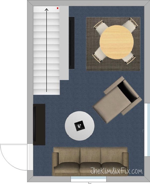
The room seems so much larger this way:

Here it is from the same angle:
Before:
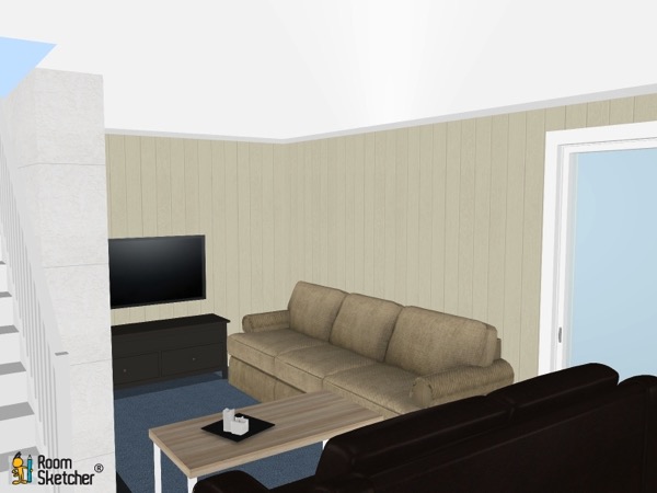
After:

Seating for 8, a great space for entertaining.. I can just imagine myself there with a fire in the fireplace on a cool fall night!
So hopefully that gives Lisa some ideas on things she could try with her fireplace. And if you have any suggestions, I would love for you to leave them in the comments below. Remember.. Be nice and leave constructive comments only. And if you have a design dilemma.. feel free to send them my way. bloggeradmin (at) thekimsixfix.com!


